From my Notebook >
NoteCase Pro Review: Cross-Platform Hierarchical Note-Taking

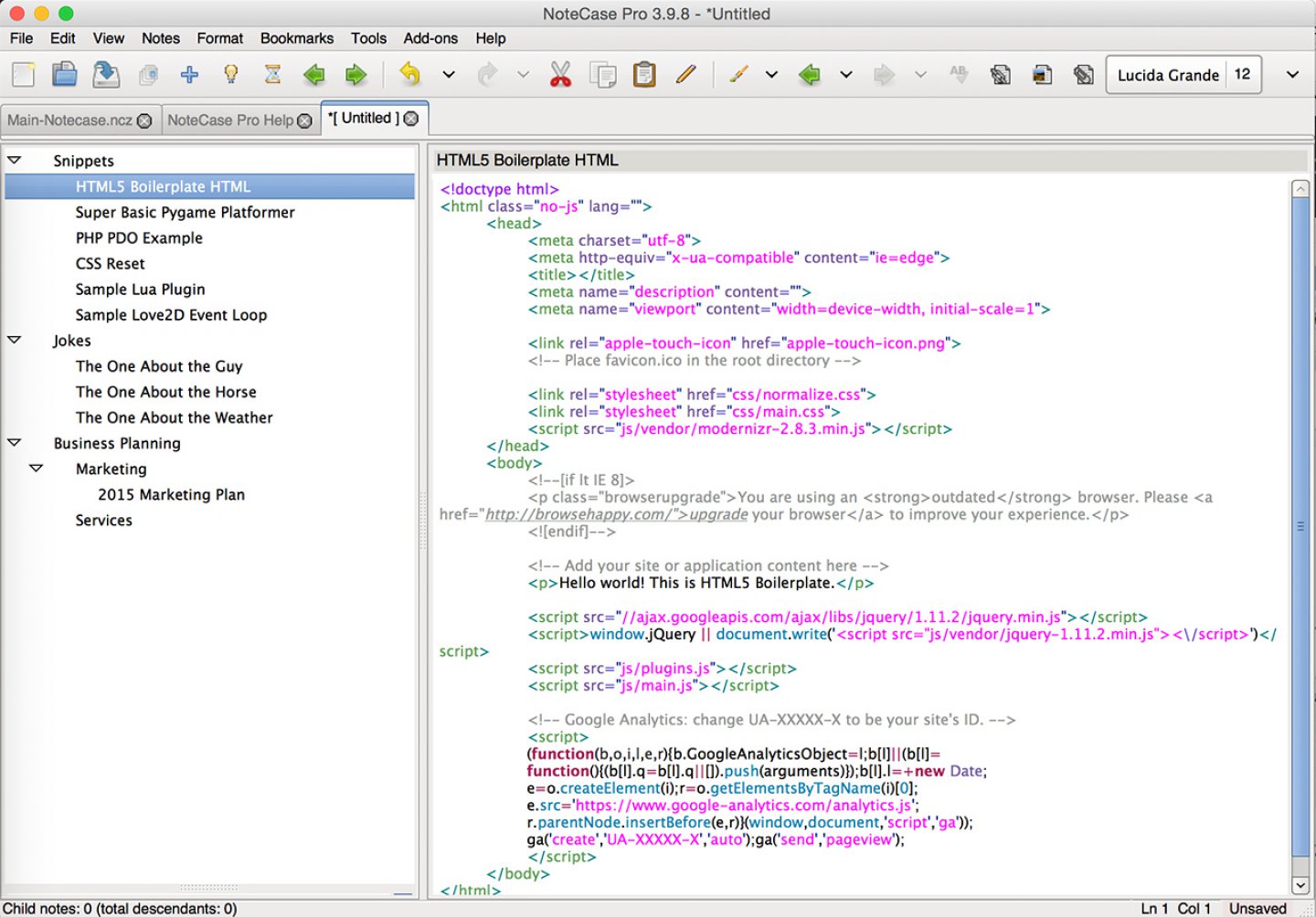
Notecase Pro is a cross-platform application for keeping hierarchical notes. It stores the notes in an SQLite database, and exports to a variety of formats. The software supports note tagging, in addition to the normal hierarchical layout. The full list of features can be found at the Notecase Pro website. There is also a community forum that is semi-active.
I have used Zim as my hierarchical note-taker on Linux for years and years. But when I bought a Mac, Zim was a pain to install and maintain, and other hierarchical solutions were also a pain to install and maintain. I looked at big solutions like Evernote and little solutions like Circus Ponies. I even compared features at Wikipedia’s fabulous comparison page.
Finally, I gave up and installed NValt on my Mac. I found it when I started using Macs again, and I used it for a few years but I was really, really missing the hierarchy as well as some other features I had in Zim. All of my notes felt kind of disorganized, but at least I had a search feature.
I started taking more notes on my desktop Linux machine just because it had Zim installed, which for all its inconvenience (it’s in my office, not with me as much as my laptop) felt like a big improvement.
Mac Hierarchical Notes
Finally I decided to search until I found something that would work on my Mac. After many Google searches, I finally found Notecase Pro via an ancient review on some Linux magazine website. I feel like I was very lucky to find it.
The Notecase Pro website doesn’t seem to come up in Google results when you search for “Mac hierarchical notes” or similar terms. In fact, from a search engine optimization perspective, the Notecase Pro website is very poor. The title tags do not change from page to page, the page titles are placed in h4 elements in the body text itself rather than h1 elements, there are not cross-linked individual pages that highlight important features like hierarchical note taking, and many different types of topics are discussed on longer individual pages.
In addition, while the software comes with a very impressive community-updated Help notebook, there is no similar section on the website, nor is there a blog that discusses the latest additions to the software in layman’s terms and shows how they might be beneficial.
While I don’t expect software authors to be SEO professionals, I’m mentioning this factor in the review in case others want to keep that in mind for marketing their own software. To keep your website ranked well on search engines, it’s a good idea to actively post helpful information there on an ongoing basis and avoid the appearance of a bare-bones brochureware website.
Getting Your Questions Out of the Way
But hierarchy sucks? What if you don’t want to organize? Tags are available. Search is available. You can still be very, err…floaty, if you want.
But it uses old GTK widgets? The widgets still work just fine. Even scrolling on a Mac worked the way I expected.
But it’s ugly? I don’t think I’d call it ugly. Outdated in style is more like it.
But it’s non-retina? I don’t even notice on my retina screen. When I go out of my way to notice it, I notice it.
But it doesn’t save to text files? It saves to an SQLite database, which is still pretty cool. You can export to text files, too. Sure, I can’t grep around my notes from the command line, but that’s not on my a requirements list right now.
But it’s not markdown-based? I go into this below.
But it’s not Evernote? I’m one of those people to whom the Evernote ecosystem seems more like a big blob of cool things tied up with unnecessary stuff, like using Microsoft Word to keep a to-do list. It’s definitely capable!
Pros, as I See Them
- Hierarchical note taking
- Store code snippets—supports tons of languages with highlighting and line numbering.
- Use it on Mac, Windows, Linux, etc.
- It’s under active development, with changelogs available at the website
Cons, as I See Them
- I do not have my notes with me on my phone anymore. With NVAlt I could just use Dropbox to access my text file notes. This hasn’t been super crucial yet, but maybe there’s some SQLite client that can help me with this, or maybe I should explore NoteCase Pro’s Android app.
- Synchronization is a bit odd. Server, port, yada yada. Hmmm…am I going to have e.g. firewall problems using this via WAN? I haven’t tried it yet, but more recent applications have raised the bar for synchronization usability.
- The audio recording feature seems not to work on a Mac (I don’t use it anyway, but I’ll leave it in here).
- I kept finding notes that were titled with a red font color. Pretty soon I discovered that my OS X shortcut for Spotlight (command + space) was “marking” my notes. When the problem persisted after I changed the NoteCase Pro shortcut, I discovered that I was right-clicking notes to add a child note (a Zim habit) and this action was also marking the notes. Again, not really a con as much as a note that you should expect that this is not a native app designed to fit expectations really tightly on your device.
- The note styling doesn’t enforce semantics as much as I would hope for, coming from NValt and other Markdown-based products. This would be really nice because I can use Markdown with my website CMS software, and use software like Pandoc for even more document translations. It does seem like you can still work with styles in a structured manner, but I haven’t got very far into this feature yet.
- The note icons, which I tend to use quite a bit, are all a bit distorted somehow. I’m not sure if this is because I’m using a high-DPI screen. It’s not a big problem, but it’d be nice to see them back in their original state (I recognize them from other applications).
Customizations I Made
- I turned on Autosave immediately, in 30 second increments. Zim and NVAlt both lack a “save” button, so this difference made me really nervous. “Save if changed” would be nice, since I get Dropbox “hey this file was updated” notifications on my other computer every 30 seconds, but maybe that feature already exists. There are a lot of features and settings.
- I changed the application icon to a Tardis, because my notebooks tend to look small on the outside and huge on the inside. I think it’d be a good idea for the author to upgrade the application icon, since it is looking really dated at this point. He does not need to use a Tardis icon.
- I added a button for “Add Child Note” to the toolbar.
- Added a timestamp button to the toolbar; inserts a timestamp into the note. Nice.
- Added a paste-without-formatting button to the toolbar (I know about shift+command+v)
What license did I purchase? One full major version, all platforms. The price at the time was (and maybe still is) $28 USD. A variety of licenses are available, and this one seemed like a good way to evaluate the product to me, since I use multiple platforms, and a new major version is released about every couple of years.
Was it worth it? Oh definitely. This was not a whimsical “hey, that one looks cool” App Store purchase. So my feeling right now is not that same post-app-purchase ambivalence I’ve experienced in the past. It’s actually pretty close to complete satisfaction at having found a solution to a problem that’s been going on for a few years now.
The fact that NoteCase Pro handles code snippets so well was the icing on the cake for me. In addition, the software seems to be more robust than I was expecting. It hasn’t choked on anything I’ve asked it to do, which is not always the case with note-taking software.
Summary
While it may not look as cool as the other note-takers on the market, I can highly recommend NoteCase Pro as a hierarchical notes app. It has a ton of great features and supports code snippets in addition to regular multimedia-style notes. If you give it a try, let me know what you think. An almost fully functional trial version is available via the software website.

 Friendlyskies.net