From my Notebook >
Refinement vs. features: The 21st century software mindset

Lots of savvy people I know are talking about refining their software needs. For my part, I feel like I refine my software toolset constantly at work.
I read somewhere that software in the 21st century is written to solve a very specific problem. The hundreds of niche apps that are released every day seem to be solid proof of that.
Propellerheads, a music software company, thought everybody wanted the Propellerheads’ desktop music software interface on their iPhone, so they developed Rebirth App. Imagine turning tons of little knobs with your finger—we’re even closer to the real thing now!
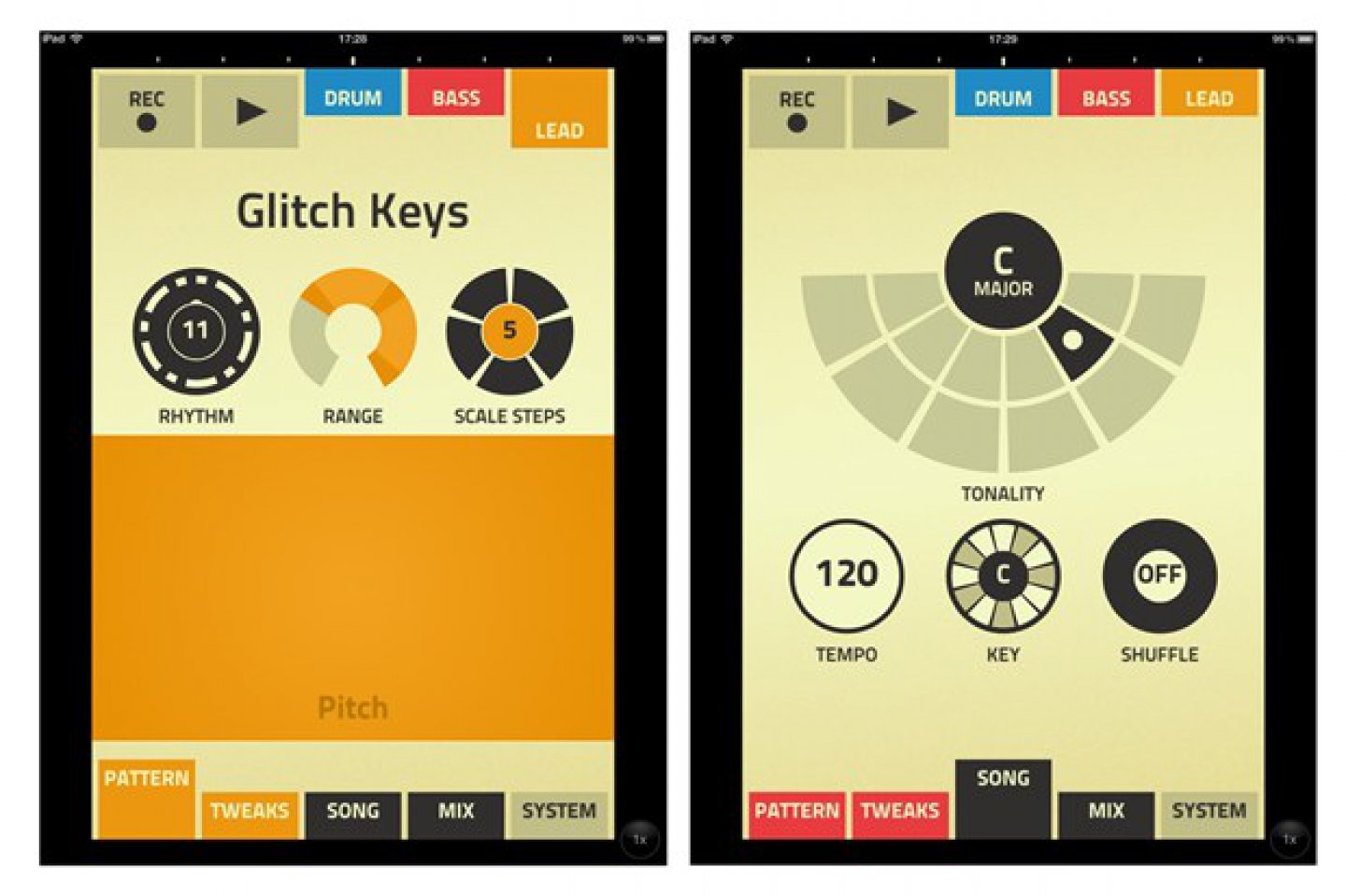
Oops. Users wanted a refined interface. Designed for a small screen. Less busy. More direct. Even fewer features. Short-form, so to speak. But targeted at creating a specific experience, rather than just a shrunken copy of an existing software tool.
Finally, just this last week, Propellerheads turned around and released Figure. The experience is much better. You can glance at the two interfaces and understand why almost immediately.
When I evaluate software now, I want to know if it is:
- Simple
- Adaptable to my toolchain or workflow
- Meant to fit my platform
- Reasonably flexible
- Well-designed
I don’t need metaphors like shiny knobs or backlit V/U meters, but I do expect a cohesive design. It’s a different sort of effort, discarding decoration so often because decoration can really slow down the software evolution process. In software, every decorative item is an item that must be maintained and looked after in the future.
In software, good design so often means refinement. And as Propellerheads showed us, refinement can mean a costly return to simplicity.

 Friendlyskies.net